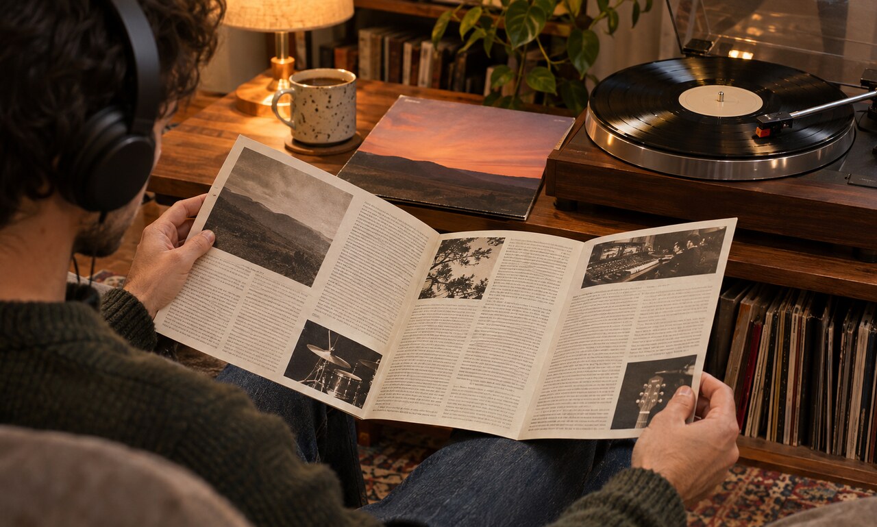
A reader meets a book twice: first as an object, then as a text. The cover occupies the space between those encounters. It suggests genre, mood and intended audience before the story or argument has had a chance to speak for itself.
Design creates an early promise
Typography can make a title feel restrained, urgent, playful or historical. An illustration may establish a world, while a photograph can make a subject feel immediate. Even the amount of empty space matters. A crowded cover signals abundance or energy; a spare one can imply seriousness, mystery or confidence.
These signals are not a summary. They are a promise about the kind of attention the book will reward.
Genre has a visual vocabulary
Readers learn to recognize categories from repeated design choices. Crime novels often use sharp contrast and compressed type. Romance covers may favour expressive lettering and close human figures. Essays and literary fiction frequently lean on metaphorical images that leave room for interpretation.
Designers can follow those conventions so a book is easy to place, or bend them to make it stand out. The balance is delicate: a cover must attract the right reader without making the book look interchangeable with its neighbours.
The physical edition changes the message
Paper texture, foil, embossing and the weight of a jacket affect how a printed book feels in the hand. A thumbnail in an online shop has different demands. It needs a clear silhouette and legible title at a small size. A successful system often works at both scales without becoming simplistic.
Interpretation continues after purchase
Once the book is read, the cover can acquire a second meaning. An image that seemed decorative may reveal a connection to a scene or idea. Some readers come to see the design as inseparable from the work; others imagine a different visual language entirely.
A good cover does not dictate the reading. It opens a door. By giving the book a public face, it helps the right curiosity find the words inside.
READ NEXT