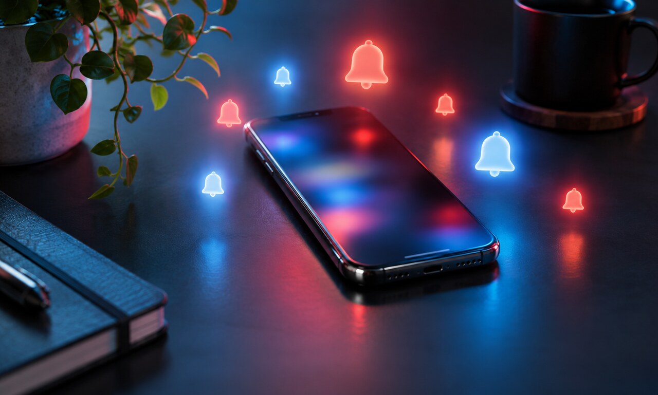
A notification lasts only a moment. It appears, makes a sound or lights the screen, then disappears. The interruption can feel too small to matter. Yet a day filled with these small claims can leave attention divided long after the final alert is dismissed.
The cost is not limited to the seconds spent looking at the screen. An alert can replace the thought that was forming, pull a conversation off course or turn a quiet pause into another decision.
Not every update is an interruption
Many notifications are useful. A message from a family member, a change to a flight or a warning from a bank may deserve immediate attention. The problem begins when every product treats its newest activity as equally urgent.
A discount, a suggestion, a reaction and a security warning should not arrive with the same visual weight. When they do, the user must repeatedly perform the sorting that the product could have done before sending anything.
Badges create unfinished business
A numbered badge turns information into a visible debt. Even when the underlying updates are unimportant, the number suggests that something is waiting to be completed. Clearing it provides a small sense of closure, which can train us to open an app without a clear reason.
This design is effective at producing visits, but it may weaken the relationship between the person and the product. A tool that constantly demands attention can become difficult to trust, especially when the alerts repeatedly lead to nothing urgent.
Batching changes the rhythm
Some information is better delivered as a summary. Several social reactions can become one update. News can wait for a chosen briefing time. Shopping suggestions can remain inside the app until the user opens it intentionally.
Operating systems increasingly offer scheduled summaries and focus controls, but these features still place much of the burden on the individual. Products can help by offering clear notification categories, sensible defaults and honest explanations of what will be sent.
Build a hierarchy of urgency
A practical reset begins with three groups. Keep immediate alerts for people and events that genuinely require a response. Batch information that is useful but not urgent. Turn off promotional or repetitive updates that add no value outside the app.
Review the lock screen rather than the settings list. The lock screen shows the real pattern: which apps dominate, which alerts repeat and which ones are never acted upon.
Attention is part of the product
Good notification design is not silent by default. It is selective. It recognizes that an interruption spends something the user cannot instantly recover: the continuity of whatever they were doing before the screen lit up.
An alert should earn that cost. When it does, notifications feel like assistance. When it does not, the technology stops serving the day and begins arranging it.
READ NEXT